The Art of Choosing White Paint
White paint seems like it should be simple. Then you bring home six nearly identical samples and realize that one looks yellow, another suddenly looks gray, and the beautiful creamy white you saved on Pinterest looks completely different in your own kitchen. The reason is simple: there isn't one perfect white. There is the right white for the room around it.
At HL Design Studio, I think about paint as part of the larger story of a home. Natural light, flooring, cabinetry, countertops, trim and moulding, wood tones and even the rooms you can see beyond it all influence how a white will read.
Three Whites Worth Knowing
There are hundreds of whites to choose from, but these three are a useful place to begin because each creates a slightly different version of a warm, inviting neutral.
Benjamin Moore White Dove
White Dove is a beautiful starting point when you want a room to feel white, but never stark. It's soft and warm without becoming overtly creamy, which makes it especially beautiful alongside natural wood, warm stone, linen and aged brass. I love this type of white in a home where the materials deserve attention. It is a great white for a bathroom.
Think warm oak floors, marble counters, beautiful millwork or a vintage rug. White Dove can quietly support those elements rather than competing with them.
Consider White Dove when: you want a soft, versatile white that still clearly reads as white.
Benjamin Moore Swiss Coffee
Swiss Coffee takes the warmth a little further. Do you like at Shea McGee’s beautiful home and start dreaming - that is Swiss coffee with lower saturation in the color. It has a beautiful yellow undertone that you would never notice, and with a clever add - Shea decreased the yellow with slightly less saturation.
It's creamier and can give a room the relaxed, established quality we love. Particularly when paired with oak, walnut, natural stone and other organic materials.
It can be especially beautiful in homes where a crisp white would feel disconnected from the architecture. But warmth needs context. In a room that already receives very warm natural light or contains yellow-toned finishes, Swiss Coffee may read warmer than expected.
Consider Swiss Coffee when: you're looking for a softer, creamier backdrop and your home's materials can support that warmth. Do not pair with surrounding yellow furnishings or neighboring yellow rooms.
Sherwin-Williams Alabaster
Alabaster often enters the same conversation because it has the relaxed softness people are usually looking for when they say they want a “warm white.”One important distinction: Alabaster is a Sherwin-Williams color, while White Dove and Swiss Coffee are Benjamin Moore.
Rather than trying to find a perfect equivalent between brands, I prefer to identify what you actually like about the color.
Is it the warmth?
The softness?
The way it sits next to natural wood?
That's far more useful than matching a paint name.
Paint matching can get you close. Understanding undertones gets you the room you actually want. White paint typically have undertones of one of the following; green, pink, blue
Look at Your Room Before the Paint Chip
Before comparing whites, take inventory of what isn't changing.
Your floors.
Countertops.
Cabinetry.
Stone.
Wood tones.
Tile.
Large upholstered pieces.
And, importantly, your natural light.
These elements should help determine your white, not the other way around.
A warm white next to a cool countertop can suddenly appear yellow. A crisp white surrounded by warm woods can feel disconnected. The same paint can look beautifully neutral in one room and surprisingly gray in another.
That's why copying someone else's paint color isn't always successful.
Pinterest Is the Inspiration. Your Home Chooses the White.
Pinterest is wonderful for discovering what you're drawn to.
But photography, editing, exposure, artificial lighting and even your screen can dramatically change the way a paint color appears.
Instead of simply asking: “What paint color is that?”
Try asking: “What do I like about the relationship between these materials?”
Maybe it's creamy walls against walnut cabinetry.
Or warm white millwork with marble and brass.
Or the contrast of a quiet white room against a dark vintage rug.
Use inspiration to understand relationships, rather than trying to copy a formula.
That's how a designer looks at the image.
Sample—But Don't Sample Everything
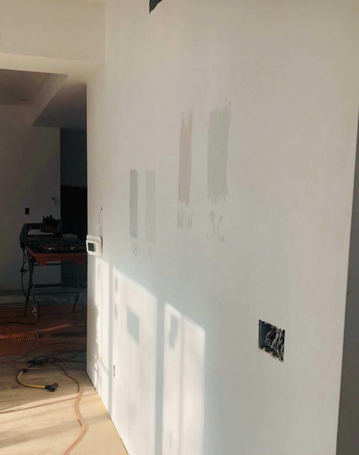
Those are all different white paints.
Notice the shadows below, that type of light will dramatically change a white paint.
Once you've considered the permanent materials in your room, narrow your choices to two or three.
Then sample generously.
Look at them in morning light. Afternoon light. At night with your lamps turned on.
Move the sample around the room if you can.
And resist the urge to compare twelve nearly identical whites.
More options don't always create clarity.
Often they simply create noise.
Should the Walls and Trim Be the Same White?
They certainly can be.
Using the same white on walls, trim, cabinetry and even ceilings—with thoughtful changes in sheen—can create an incredibly sophisticated, cohesive result.
It allows beautiful architecture to provide the detail rather than relying on contrasting paint colors.
But in a home with wonderful historic millwork, subtle contrast may be exactly what helps that architecture come forward.
There's no universal rule.
Instead ask: What deserves attention in this room?
Let Something Be Quiet
This is one of the principles I return to most often. A room doesn't need statement tile, statement lighting, statement wallpaper, statement stone and statement furniture. When everything asks for attention, nothing gets it. If you've invested in beautiful tile, let us notice the tile. If you have gorgeous walnut cabinetry, let us notice the wood. If your dining room has an incredible antique rug, the walls don't necessarily need to compete with it. White can be powerful precisely because it gives everything else room to breathe.
So, Which White Should You Choose?
Start with the feeling you're trying to create. For a soft white that still clearly reads white, White Dove is a wonderful place to begin. For something warmer and creamier, especially alongside organic materials; Swiss Coffee deserves a sample. And if you're drawn to the relaxed warmth of Alabaster, sample it because of those qualities rather than because someone else's home looked beautiful painted in it. Then stop looking at the paint names. Look at your floors. Your countertops. Your windows. Your furniture. The room beyond.
Because the best white isn't necessarily the one everyone else is using. It's the one that makes everything you already love about your home look better.

Trim: Chantilly Lace by Benjamin Moore (although not mentioned in this blog, an excellent trim color)
Walls: Swiss Coffee by Benjamin Moore